 The following is a guest post we’re pleased to share by Karthik Balasubramanian and Jake Kendall from the FSP program at the Bill & Melinda Gates Foundation.
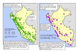
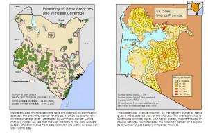
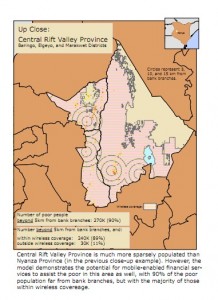
In this blog post, we document the process of using GIS software and spatial data to assess the geographic distribution of bank branches, ATMs, CICO agents, and other financial access points relative to the spatial distribution of population (including the poor). (See these links for a sneak peak at our future post which will explore country mappings of Peru and Kenya. We have efforts underway to extend the Kenya mapping and to map Tanzania, Uganda, Pakistan, and other countries.)
Financial access is first and foremost a spatial phenomenon
Being near enough to a retail access point (e.g. bank branches, ATMS, agents, etc.) is a necessary first step before someone can use financial services – especially the world’s poor who don’t drive and often have a highly variable cash income stream, necessitating frequent trips to the bank.[1] For example, bank branch penetration, averaged only 3.3 branches per 100,000 people in the countries of Sub-Saharan Africa and 6.8 in South Asia (compared with 31 in the developed world) in 2009.[2] As a consequence it’s estimated that 88% of all adults in sub-Saharan Africa and 78% in South Asia are un-banked compared with less than 10% in much of the developed world.[3]
This situation comes about because building retail access points is expensive and financial service providers are keen to build as few as possible. Providers seek to place these points optimally in relation to the population so as to serve their existing customers and perhaps even gain territory with minimum outlay.
Financial inclusion advocates and policy makers also want broad coverage of the population by financial access points but would like to see that poor people also have access, a concern not always shared by providers.
Thus, solving the spatial distribution problem is central to the goals of both financial service providers and financial inclusion advocates. Having better data and analytics to understand financial access on a spatial dimension is going to be critical to solving this challenge.
New technology in the form of inexpensive GPS receivers, GIS software, and widely available spatial data, combined with enabling factors like Google maps and satellite images on the internet has made it feasible to attempt to map out the entire retail network of the financial system in many countries at relatively low costs. Once this has been done, it facilitates a range of analyses that can be of operational value to the commercial sector, the public sector, regulators, and donor agencies.
Software requirements, data inputs, and processes for a basic proximity analysis
Due to the advances in technology and enabling factors, the comprehensive mapping and analysis of a country’s financial landscape described below could be done in most developing countries for under $100,000 dollars and since central banks could easily require new branches to report location information, updating it would happen automatically. Contrast this to the >$1m often necessary to complete comprehensive household surveys such as the World Bank’s LSMS or FinScope’s surveys – a cost which must be paid again each time the data is updated.
Software and Hardware requirements: Spatial analysis (also known as GIS analysis) is generally only constrained by the availability of data (not software or technical expertise). The most widely-used software package for spatial analysis is called ArcGIS. This project is offered by the Earth Science Research Institute (ESRI) for $100 for a single-user non-profit license. Other packages (including open source) are also available.
Population data requirements: The first input to basic proximity analysis is a global spatial layer of population; there are two main high-resolution global datasets available for civilian use. The first, the Gridded Population of the World (GPW) produced by Columbia University’s Center for International Earth Science Information Network (CIESIN), is free, updated every 5 years, and has pixels sized 2.5 arc-minutes (5 sq km at the equator). The second, called LandScan, is produced the US government’s Oak Ridge National Laboratories (ORNL), is $6,000 for non-profit use, updated every year, and has pixel-sized 30 arc-seconds (1 sq km at the equator). With these datasets, the relationship between population and access points can be mapped fairly accurately.
 Unfortunately, these datasets don’t have socio-economic information included so mapping the poor population to this level of accuracy is not easy. Most countries (even many developing countries) do track poverty statistics to relatively small geographic areas, such as states or even counties. Poverty ratio data can be overlaid and multiplied by the population density data to get rough estimates of poverty density. Granted, this approach loses some fidelity to the extent that poor people are clustered within these smaller geographic units (say in rural areas or slums around cities) but the approach should provide at least a rough mapping that will work for many types of analysis.
Access point locations: Using these population density layers as the base dataset, coordinates of bank branches, agents, ATMs, and/or POS can be overlaid for the analysis. Collection of these coordinates has become extremely simple thanks to inexpensive GPS receivers. Stand-alone GPS receivers that can record highly-precise coordinates can be purchased for less than $75; additionally, an increasing number of smart-phones are equipped with built-in GPS receivers. Local consultants in many countries can map the entire country’s retail financial access points for around $50k.[4]
The recipe: Once these coordinates are plotted onto the spatial layer of population, basic “buffer” analysis can be done easily with the ArcGIS package to generate metrics such as the percentage of the population that is within some distance of a point of interest (bank branches, ATMs, POS devices, and/or agents). To determine the percentage of the poor population within a particular radius of points of interest, the base layer of population can be multiplied by poverty rates by the lowest level of administrative unit (e.g. county or city). The next blog post will walk through this process applied to Kenya and Peru.
What are the uses for a spatial data framework?
Below are some productive uses for these spatial analyses that have come up in our conversations with the various actors:
 A better way to measure financial inclusion – Perhaps the most important use of the spatial analysis approach documented here is that it is capable of generating much better metrics to track financial access that existing approaches. current standard access measure in the financial inclusion world has been a crude density measure – i.e. branches per capita or ATMs per 100,000 people. Data of this sort was collected worldwide by Kendall, Mylenko, and Ponce (2010) who extended the approach first used in Beck, Demirgüç-Kunt, and Martinez-Peria (2007). However, these measures do not take into account the geographic clustering of financial access points or of poor populations within national boundaries. A more precise approach to measuring access is to use proximity measures such as the percentage of poor people within 5km of a bank branch, or median distance to branch. A notable exception to the lack of proximity measures in existing data sources is the metric proposed by the Alliance for Financial Inclusion, which is the percent of the population in a city or town with at least one access point (see here, though this measure too has obvious drawbacks since metropolitan areas can be quite large) [see our next blog post with more detail the subject of using spatially derived metrics as better financial inclusion tracking metrics and using the spatial analysis framework developed here as a better way to guide financial inclusion policy making]
Commercial applications – Another key area where spatial analysis could be useful is with commercial providers who wish to fine tune their deployment of retain infrastructure.
- Optimizing the CICO ( cash in cash out) agent network expansion- By plotting the coordinates of CICO agents (and other access points) onto a spatial layer of population, GIS analysis can produce a map that can make geographies with large, uncovered populations easily identifiable.
- Liquidity Management- By adding CICO agent activity data to the map, GIS analysis can identify where liquidity issues are likely to manifest themselves, deployments can optimize their provision of liquidity management support.
- Customer targeting and marketing- By plotting the locations of customers and triangulating this information using wireless network call detail records (CDR), telcos can identify which customers are active voice and SMS users but not mobile account holders. This then can marketing campaigns be more geographically targeted for maximum effectiveness.
Public sector applications
- G2p targeting- By multiplying a spatial distribution of population by poverty levels of administrative units from census surveys, GIS analysis can generate high-resolution maps of where poor people live. With this knowledge, G2P programs can more effectively target the poor. Furthermore, by overlaying the coordinates of access points, G2P programs can assess the most effective channel for delivering these payments to the poor.
- Geography based incentives – While economists snipe (often with good reason) at the role of public sector incentives in guiding the financial sector, there may be some cases where carefully designed incentives to extend retail infrastructure into poor areas could be a valuable policy tool.[5]
Regulatory applications
- Policy analysis- Similarly, spatial analysis can help regulators critically analyze the effect of central bank policies. For example, GIS analysis can estimate what percentage of India’s population could not be served due to RBI’s regulation that agents must not be more than 30km from a bank branch.
- Identifying underserved geographies- Spatial analysis can help regulators easily identify underserved geographies and can help shed a spotlight on the scale of the inclusion problem.
Donor applications
- Standardized grant progress and performance metrics- Metrics resulting from spatial analysis can be the basis for evaluating the performance of grants whose objectives include increasing the proximity of financial access points to the poor. For example, donors will be able to track the impact of agents on the poor’s proximity to access points. In other words, we will be able to track, in a standardized way, how many more (poor) people are within access thresholds of a financial access point due to the expansion of grant-funded services beyond the catchment areas of banks and ATMs.
While the process we have laid out here is focused on banks and retail banking infrastructure, there is no reason why it could not be extended to map credit and insurance provider locations as well as remittance and bill pay points. The spatial dimension is often ignored in financial inclusion discussions despite its’ being the key dimension along which financial access is determined. Hopefully this oversight will be rectified now that the field has a better way to track and assess progress on this dimension.
We plan to continue to explore the topic of spatial mapping with a series of future blog posts and our forthcoming paper on the topic.
[1] In a blog post on NextBillion.net Ignacio Mas and Jake Kendall discuss the fact that academic researchers have not studied the extent to which distance related transaction costs are a key barrier to financial inclusion, despite the fact that reducing the distance related barrier is obviously a necessary first step to bringing people in to the financial system http://www.nextbillion.net/blog/2011/09/28/wheres-the-bank-
[2] From data described in Kendall et al, (2010) “Measuring Financial Access around the World,” World Bank Policy Research Working Paper # 5253. Numbers from Author’s calculations, see www.cgap.org for raw data.
[3] Ibid, see Eurobarometer surveys and the Federal Reserves’ Survey of Consumer Finances for banking rates in Europe and the US.
[4] There are other commercial uses for this kind of mapping which have driven some marketing and consulting companies to develop the capability. For instance, companies with large numbers of retail outlets often want exact location data to feed into mapping features on their web page to help customers find the nearest point.
[5] See for example the paper by Burges and Pande (2004), “Can Rural Banks Reduce Poverty? Evidence from the Indian Social Banking Experiment” which presents strong evidence that the India social banking laws, which required banks to branch into rural areas, did have a positive effect in reducing poverty.

